|
Last Update 4 December 2005 This page is a working document and is not to be quoted or referencedReturn to GCP Home Page Earthquake Effects and DistanceThis is a look at large earthquakes as a class, to see if the GCP data show correlated effects, and then to explore whether these are distributed homogeneously. This is largely Peter Bancel's work, and though much remains to be done, we agree that this interesting material should be available. At this point the same indications are present in several different perspectives, so we can have reasonable confidence in the main points.
We begin with the assessment of all earthquakes from 1999 - 2004 with Richter magnitudes M > 7.0 There are 103 such events, and within these a subset of 95 that don't overlap any of the impulse events. This is the analysis performed for the 46 impulse events, namely: align the events to their t = 0 and superpose them for the period t = -4 hrs through t = +7 hrs. The first results indicate that the covar and Z^2 measures for earthquakes yield cumulative deviations remarkably similar to those for the impulse events, shown in the following plot.
Larger ContextA simple division by quake magnitude doesn't take into account damage, geographic location or media intensity, but some of these questions can be addressed. The next plot looks at strong quakes (Richter magnitude R > 6) from 2000-2004 for two geographic regions. [The network has > 25 regs online after 2000, so this time period avoids data with relatively few regs. Including quakes from 1999 doesn't alter the picture, however.] The left panel shows all such quakes and the right panel a smaller subset with R > 6.3. The "Pacific" region is the Asian Pacific east of Japan and Australia/Indonesia. These ocean quakes are far from populations and most eggs. The "NorAm/Eurasia" region is California/Mexico and the Mediterranian/Near East out to Afghanistan. These quakes are near populations and eggs. The dispersion statistic is calculated from T=0 out to 4 hours (blue curve) and also out to 7 hours (red). The dispersion statistics are summed (signal averaged) for all the quakes in each of the two regions. The error bars on the plot are 1-sigma. The "NorAm/Eurasia" effect sizes are about 0.5 and 0.33 (normal zscore). This is similar or larger than the average effect size for GCP events. The "Pacific" effect sizes are within 1-sigma of zero.
The next plot also shows the dispersion stat for earthquakes using the 7-hour examination period with start time t=0. The quakes have richter magnitudes R > 6.0 (left panel) and date from Jan 2000 thru Dec 2004. The central panel shows R > 6.3, and the right panel just those between 6.0 and 6.3. The regions have been modified a bit from the previous figure. They are North America, Europe and Asia, South America, and Ocean, as indicated in the axis legend. The "Ocean" region specifies undersea quakes far from populations. This group now includes quakes from an active region in the South Atlantic, but most are located in the Pacific. There does seem to be some evidence for data excursions that start at the time of the quake for earthquakes occurring in populated parts of the world where we have eggs. The effect size is in the 0.5 range, and is bigger than the average effect size of GCP events (about 0.3). There is an orderly relationship of effect size to the location of the quakes. The largest effects correspond to quakes in North America, Europe, and Asia where there are large populations and where we have relatively broad coverage in the Egg network. In contrast, in South America, where we have few eggs, and in ocean areas with none, the effect is indistinguishable from zero.
(Click on the figure to get a re-sizeable image showing full detail.)
The plots compare high R (red) and low R (blue) quakes for the different regions, using R=6.3 as the divide. This gives roughly equal numbers of quakes in the two groups, for all of the regions. The trend of a larger effect size for larger quakes maintains. The right panel of the figure plots effect sizes calculated for an examination period of 7 hours. and though different in detail, shows the same separation, with most of the effect in populated areas with good egg network representation.
(Click on the figure to get a re-sizeable image showing full detail.)
The four earthquake regions are categorized
as:
North America & Eurasia: quakes near
populations and (some) regs
South America: quakes far from regs but near
populations
Ocean: quakes far from both regs and
populations.
This breakdown is rough, of course.
A first look at reg distribution
examines the quake regions for ONLY the North Am regs and ONLY the Euro
regs.
The zscores in the table
are for the dispersion stat
using 3 different reg groupings (all, only NorAm, only Euro).
Examination periods are (7) and 11 hours.
The 4 quake regions are the same as in the figure (NorAm,
Eurasia, SoAm, Ocean). There are about 40 quakes for each region, except Ocean
which has 250.
The column "All Regions" has results
for the whole network.
As we have seen, the North American and
Eurasian quakes show a significant deviation of the
dispersion stat when all reg data is used.
The NorAm and Eurasian quakes, taken together, give
zscore of about 3.1.
If we look only at NorAm eggs or only Euro eggs,
much of the zscore goes away.
This says that there is a considerable contribution
coming from eggs pairs that bridge the continents.
Sorting this out will therefore take some work,
since breaking calcs into reg groupings takes a lot of calc
time.
[It is interesting that the NorAm regs as a group
show some effect, whereas the Euro regs basically do not. This same pattern
occurs if the event experiment is calc'd using only NorAm or Euro regs. I don't
know if there is something real to this...]
Epoch Analysis of Major QuakesIn earlier work on earthquakes, looking at the development of GCP network effects over time, there is a faint suggestion of non-random changes in the data around the time of the earthquake's primary temblor. Careful examination of the data with a focus on this issue reveals an impressive regularity, using an epoch analysis approach to extract signal from noise. The first map below shows the database of all large quakes (Richter magnitude 6 and above) over the period from 2000 to November 2005. The weakest quakes are small green dots. Strongest are big and red/orange. On it are plotted also the the GCP eggs in the current network, in yellow/gold spots.
The second map shows only the quakes occurring within populated landmasses in the Americas, Europe, and Asia over the past 6 years. The size and color of the spots indicates magnitude; the large red spot is the quake that created the Tsunami in the Indian ocean. The yellow spots show the locations of our eggs. Many quakes are aftershocks that occur shortly after the first temblor. All quakes are removed that overlap within 20 hours. This is necessary since we do a signal average; the cumdev excursion extends > 10 hours so a 20 hr separation between quakes is a necessary analysis precaution. The removal processes minimizes the number of discards and keeps the strongest quakes. This point is important to know since many weak quakes are removed this way. There are about 50 North American quakes and 40 Eurasian ones, using the selection criteria. The North American region is a geographic rectangle or box defined as latitude 0 to 50 and longitude -126 to -70. Eurasia is latitude 20 to 50 and longitude -20 to 95.
The analysis proceeds by aligning the GCP data corresponding to these quakes on the moment of the main temblor. From this, an epoch average is calculated for the following figures, intended to look specifically at the timing of the GCP network reaction to the quake events. The plots below show the quake alignment over +/- 30 hrs around the quake zero time. They give a sense of the timescale and perhaps a hint (again) that something is registered before the quakes strike. The horizontal axis is "Hours" and vertical axis is "Cumulative Z" for both of the plots below. The first shows the covariance measure and the second shows the dispersion statistic (for an earlier collection of 81 quakes.) Both plots display the cumulative deviation of a Zscore since the Chiquare calculations have been converted to normal statistics. There is one Zscore per minute in these plots and the pval envelopes show the 0.05 probability of the deviation.
The shape of this curve is striking, and appears to indicate the covar measure begins to deviate several hours before the primary temblor. The next figure separates the North American and the Eurasian quakes, in a plot that allows comparison. They are remarkably similar, indicating that the shape is not a fluke. On the other hand, we find that South American quakes show the prequake decline, but not the postquake rise, and a subset of Nippon quakes does not show clear structure.
The next figure shows the "dispersion" measure, which combines the covar calculation of the first figure with the network variance measure.

At this point we do not have rigorous statistics to support deep interpretations. However, it may be helpful to give a description of what is visually apparent. For most of the time shown in the figures the data have the character of a random walk, but both figures show a striking departure from the general trend centered on the defining temblor of the quakes, the zero point. The scale of the change can be seen in comparison with the slope of the red probability curve. This gives a visual indication that the steep drop beginning about 5 hours before the quake may be significant. We will continue with efforts to stabilize and interpret these tantalizing indications. When we look at the same kind of analysis but for quakes that occur in the ocean or in parts of the world where the population density is much smaller -- or where we have few eggs, the result is very different. There is no obvious structure related to the time of the quake. The map below shows all quakes that occur in areas not included in our North American - Europe - Asia analysis. There 529 such quakes larger than Richter 6 during the period of our analysis. Following this is a figure showing the cumulative deviation of the covar in the same epoch analysis as before.


Another View of Pre vs Post Covar DeviationThe following plots provide a look at the covar for quakes across the globe using a different presentation that shows the size and location of deviations 8 hours before and 8 hours after the big quakes, followed by a similar pair with data 3 hours before and after. Each map shows:
1. R>6 quakes in gray
The black dots in the left margin of the second figure show approximate scales for the points. They represent z = 0.5, 1 and 2, respectively. The max values of the zscores are around 2.3. Only grids with 2 or more quakes are calculatedd. Others have green markers.


Precursor Changes?Finally, as noted in the comparisons with GCP impulse events, the data show a slight but intriguing suggestion (see the following figure) of change beginning one or two hours prior to the main temblor of the earthquake. The black curve shows an inflection in the covar measure averaged across 95 major earthquakes at about 2 hours before the main temblor, followed by a fairly steady trend for the next several hours. Similarly, the blue curve representing 9 quakes in the GCP formal series also has an inflection at T=-2 followed by several hours of consistent positive deviation. The red curve of the Indian Tsunami event is less clear. This precursor effect, if any, will take more time and effort to analyze, but if it is real, the implications are important.

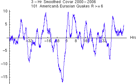
It is difficult to establish a precursor rigorously. The following figures show some further efforts, with a slightly more recent, larger database. First we look at the data with a different graphical technique. Rather than the usual cumulative deviation graphs, the first figure shows the original data with smoothing in a three-hour window to reveal persistent tendencies.

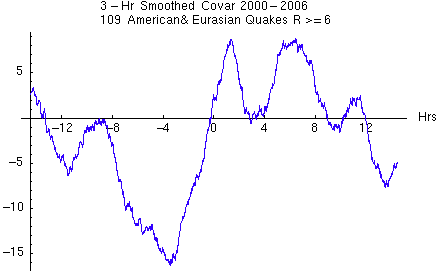
Next, we look at just the central portion of the preceding graph, T=0 +/- 15 hours. This zooms in on the deep departure from expectation, which begins 7 or 8 hours before T=0, and reaches an extreme minimum at about 4 hours before the main temblor.

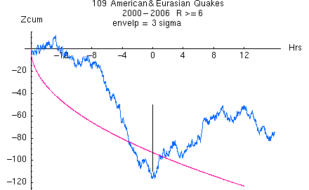
The next figure returns to the cumulative deviation format, using the same data as the preceding graph. This allows us to see that there is an accumulating negative deviation for almost 8 hours prior to the moment of the earthquakes. While it is difficult to assign a likelihood to this apparent precursor change in the data, a Bonferonni-adjusted Zscore for the slope beginning at -7 hours and ending at T=0 is over 4 sigma.

| |||||||||||||||||||||||||


